FIELD NOTE · 03
Deliberately ‘Ugly’: The Honesty and Power of Graphic Brutalism
While every image is being polished smooth, this style leaves its structure and seams exposed.
By Elian Yong · · 8 min read
STYLE ATLAS · TODAY'S STYLE #09
While every image is being polished smooth, this style leaves its structure and seams exposed.
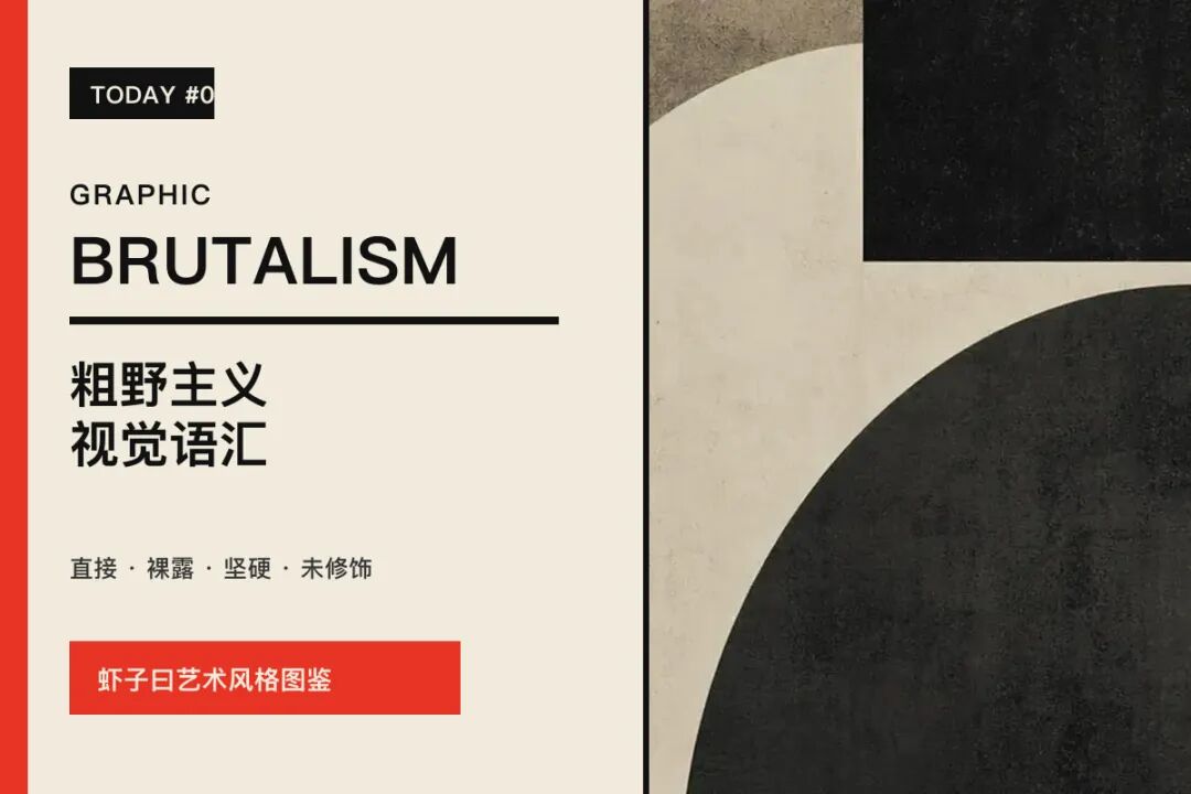
When I opened Style Atlas today, the style waiting on the home screen was Graphic Brutalism.
It is not immediately charming. The borders are hard, the structure is exposed, the typography feels almost like a system default, and the composition seems deliberately unfinished.
The longer I looked, however, the more right it felt for the present moment.
While most interfaces, posters, and AI images work hard to become rounded, smooth, and flawless, Brutalism leaves the joints visible. It does not rush to please you. It simply shows, honestly, how information has been placed on the page.
Is the composition deliberately exposing its structure so that you can see how the information was put on the table?
SECTION 01|Brutalism Is Not “Making Things Ugly at Random”
Graphic Brutalism borrows the direct, heavy, exposed character of Brutalist architecture. Just as a building may refuse to hide its concrete, Brutalist graphic design does not disguise its borders, modules, buttons, or grid.
But there is an important distinction: roughness is not the absence of design. It is the decision to leave evidence of design visible.
Real Brutalism still has order. It simply refuses to polish everything with rounded corners, shadows, gradients, and decoration until every surface resembles the same smooth plastic.
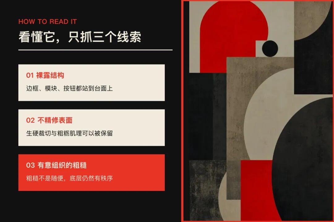
SECTION 02|Three Clues Are Enough to Read It
Exposed structure
Borders, modules, heavy divisions, and even controls that resemble default buttons are placed in plain sight. Structure is not a hidden skeleton; it becomes the image itself.
Unpolished surfaces
System fonts, abrupt crops, coarse textures, and uncomfortable empty space can all appear. But these “imperfections” must be deliberately organized, or they become mere disorder.
Direct emotion
The palette is often restrained and decoration reduced, while rigid structure creates presence. The result feels direct, hard, unvarnished, and sometimes deliberately distant.
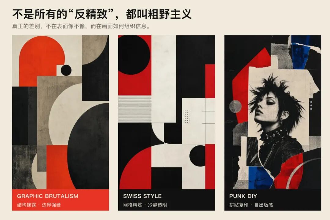
SECTION 03|How Is It Different From Swiss Style or Punk DIY?
Brutalism and Swiss Style both value information structure. Swiss design refines the grid into calm, transparent order; Brutalism deliberately brings borders, defaults, and unpolished surfaces to the foreground.
Brutalism and Punk DIY also reject polished commercial taste. Punk DIY leans toward collage, photocopying, handwriting, and self-publishing. Brutalism is centered on exposing structure and giving information harder edges.
A style therefore cannot be understood only by whether something “looks like it.” What matters is why the image is organized that way, what it refuses, and what it emphasizes.
SECTION 04|Why Are We Drawn to This Roughness Again?
Because excessive smoothness is causing many things to lose their character.
We have grown used to templated product pages, over-retouched photographs, and AI images that look immediately “correct” yet are difficult to remember. Brutalism restores friction.
It lets a brand remain less agreeable, a poster retain physical force, and an interface admit that its first job is to communicate information.
This directness is not right for every context. Medical, financial, and long-form reading products still require restraint. But for cultural events, independent brands, music, exhibitions, and opinion-led content, it can make an expression feel more credible and memorable.

SECTION 05|A Real Example: Today's “Yesterday's World”
Today's Xiazi global-news posters used the same Brutalist visual language for the August 20, 2026 edition of Yesterday's World: one daily overview and eight global stories.
Once a style enters real content, its purpose becomes clearer. Strong black, white, and red contrast establishes urgency. Thick borders and hard divisions organize tariffs, AI regulation, drone delivery, and other subjects into clear hierarchy. Oversized numbers, cut imagery, halftones, and aged-paper texture make each poster feel like a newspaper page worth keeping.
The roughness is not decoration. News is already dense with information; if everything is made soft and elegant, the priorities can disappear. Brutalism uses hard boundaries to tell the reader what to see first and next, preserving both impact and readability.
This is the shift from recognizing a style to knowing how to use it. The point is not to apply red, black, and heavy type everywhere. It is to judge whether the style suits the content. Global news needs directness, clarity, and force; Brutalism provides a shared visual grammar for them.
Open today's Yesterday's World to see the overview and all eight stories:
https://xiazishuo.com/
SECTION 06|Style Does Not Exist Only in Posters
At home it may appear as concrete, metal shelving, and open storage. In clothing it becomes utility pockets, exposed seams, and heavy boundaries. In photography it appears in building edges, temporary signs, and urban corners that have not been beautified.
Once you begin noticing life through these clues, a style stops being an English label and gradually becomes part of your own visual vocabulary.
That is why I made Style Atlas. It does not generate pictures for you. It helps you understand what looks good, why it looks good, and how to describe it.
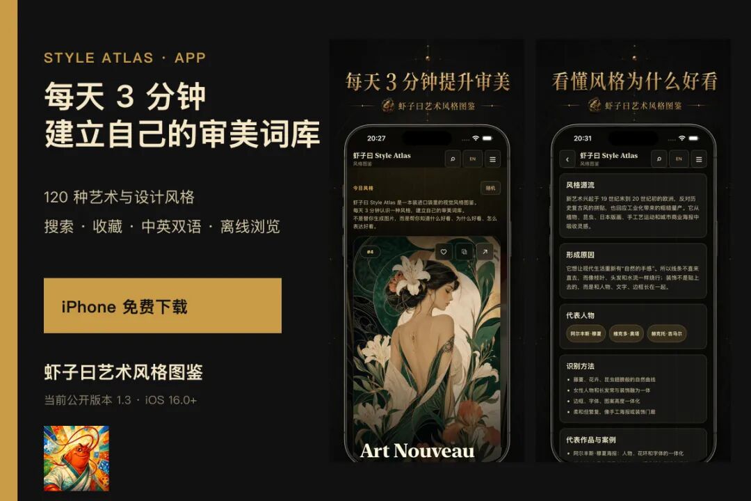
SECTION 07|Learn One Style in Three Minutes a Day
The web edition currently contains 120 art and design styles. Open today's Graphic Brutalism entry to continue with the full analysis, comparisons, and clues from everyday life.
iPhone users can also download the free Style Atlas app. Version 1.3 supports search, favorites, Chinese and English, and offline reading—120 styles in your pocket.
Does this directness feel more trustworthy to you, or does its hardness create distance?
Start with today's image and begin building your own visual vocabulary.
Style Atlas
One style in three minutes a day
Know what looks good, why it works, and how to express it
Open the full analysis of today's style
Style images and interface screenshots in this essay come from Style Atlas.