FIELD NOTES · 06
After AI Builds Your First Version, Why Does Every Change Leave You Less Sure?
Your first version is here. How do you choose what to fix next? Make it work, make it clear, then refine it.
By Elian Yong · · 7 min read

If you are using AI to build your first product, you may recognize this moment.
The first version is finally there. The page opens, the buttons respond, and the idea in your head has a visible shape for the first time. You want to send a link to your friends.
But look a little longer, and everything seems open to improvement.
The homepage feels empty. The colors could be better. A few features seem to be missing. Part of you thinks, “I really can build this.” Another part wonders, “Is it actually ready for someone else to use?”
So you keep asking AI to make changes. Try another layout, add a feature, explore a different style.
You spend a long time on it. The versions pile up, but your confidence shrinks: what, exactly, makes this version better than the last?
That is the stage I want to talk about. The first version is in front of you. How do you choose a problem worth solving next?
01 / PRODUCT NOTES|Help One Specific Person Complete One Specific Task
I start by writing one sentence:
Who will use this product, in what situation, to accomplish what?
The more specific the answer, the easier it is to judge the next step.
“Build a meditation app” is still too broad. Try narrowing it down: someone has just finished work, their mind is racing, and they want to choose a nature sound and listen quietly for a while.
Yixiu Meditation, which I built, can be examined through this kind of scenario. Below are real screenshots from the Yixiu app: its sound library and player.
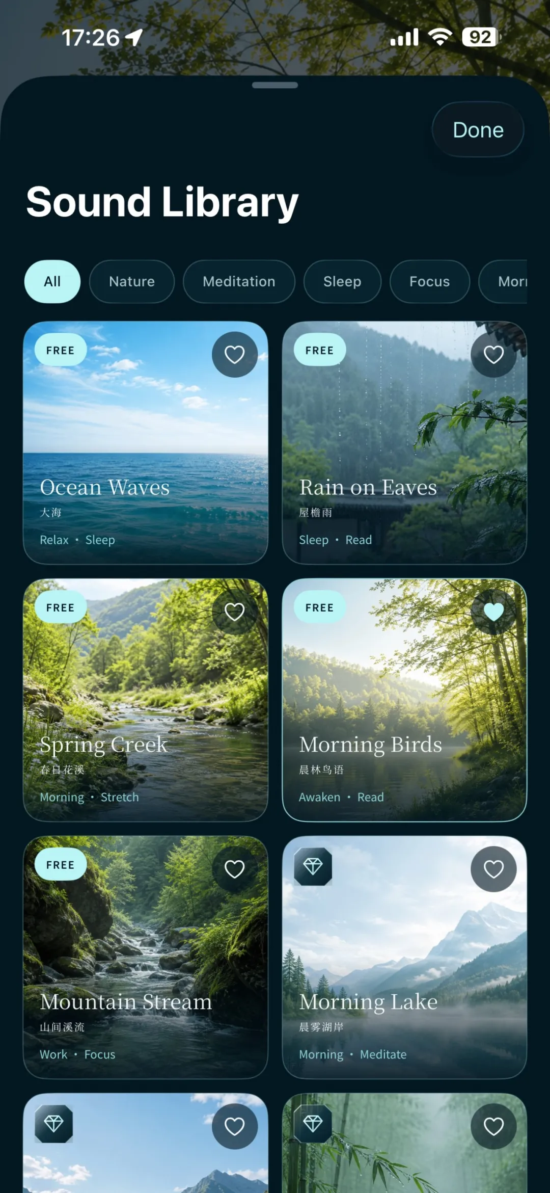
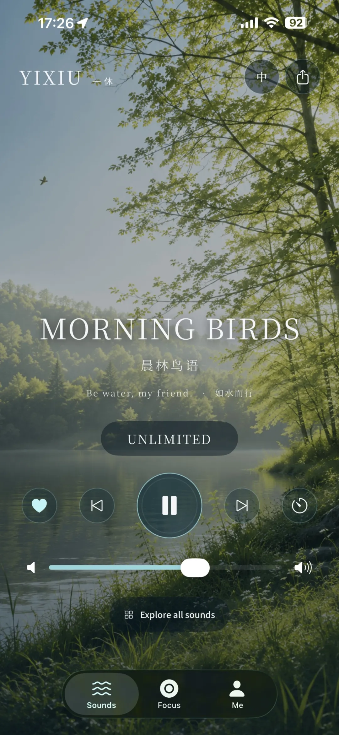
In the sound library, nature sounds, meditation music, and categories such as sleep and focus let people begin with what they need. On the player screen, playback, volume, and duration all serve the same purpose: making the sound right for the person in that moment.
The journey is short: choose a sound → start playback → adjust the volume and duration until they feel comfortable.
For now, set aside the thought that you need to “make the whole app good.” Walk through this one journey yourself.
Can this person find a sound that suits the moment? When they press the button, do they hear something or see a clear change of state? Are the controls easy to find when they want to lower the volume or change the listening duration?
When reviewing a product like this, a play button that produces no response should be fixed first. A prettier homepage gradient can wait. This is an example of how to prioritize an investigation, not a report of an actual fault in Yixiu.
A specific person and a specific task give us a starting point among all the things we want to change.
02 / PRODUCT NOTES|Sort the Problems into Three Layers
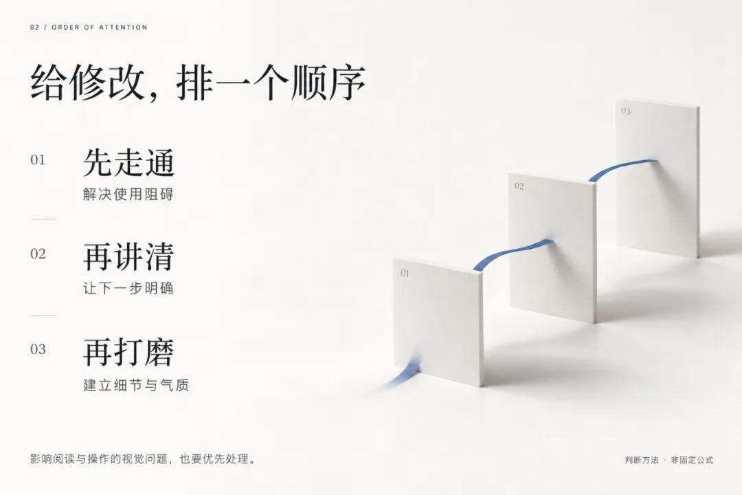
When looking at a first version, I usually think in three layers.
First: Make It Work
Can the most important task be completed? A broken button, content that fails to load, or a submission that produces no result can stop the journey altogether.
For listening, this means being able to choose a sound, start it, and pause or stop it. Fix whatever prevents that from happening first.
Next: Make It Clear
Once the product works, check whether other people know how to use it.
Does the homepage explain who it is for? Is the button wording clear? What should happen next? “Explore now” and “Play this sound” create different expectations.
Sometimes only a few words need to change, but those words determine whether someone feels confident enough to click.
Then: Refine It
Once the main task works and makes sense, gradually refine the spacing, colors, icons, and motion so the product feels more consistent and more like itself.
There are exceptions to this order. If text is too small to read, or a button's color makes the way forward impossible to find, a visual issue is already blocking use and should be addressed earlier.
Prioritize according to the effect on use, rather than whether a problem belongs to design, writing, or code.
03 / PRODUCT NOTES|Give Every Change an Endpoint You Can Check
“Help me improve the experience” makes it difficult to know when the work is done.
“Let someone opening the page for the first time choose a sound and start listening” is much more specific.
You can return to that goal and check: could they find the starting point? Did the button respond? Were the playing and paused states clear?
I turn the change into a small task card:
01. Who are we helping, and what do they need to do?
02. Where are they getting stuck now?
03. What will we change this time?
04. How will we personally verify the result?
Solving one clear problem at a time gives you something to compare before and after. Even fixing a single button lets you explain what moved forward today.
After checking it yourself, ask someone who has never seen the product to try it, if you can. Watching where they actually hesitate provides a different and useful kind of feedback.
“The page looks clearer” is a design judgment. Whether someone can really complete the task more easily still needs to be verified through actual use.
04 / PRODUCT NOTES|Let AI Help You Prioritize, Then Work Together
At this point, AI has a more specific job.
You can give it the current screen, the task, and the problems you observed:
Here is the product's current interface. The task the intended user wants to complete is: [insert one specific task].
Follow this task journey and identify possible obstacles. Group them into three categories: cannot complete, hard to understand, and room for refinement. Explain the evidence behind each judgment. Mark anything you cannot determine as needing verification.
Recommend the single most worthwhile issue to address first, explain why, and propose a change and steps for checking the result. Let me confirm the plan before implementing it.
This prompt gives the discussion a shared basis.
AI can help us notice omissions, compare approaches, and implement changes. Deciding which problems matter most and which features can wait still requires us to consider our own goals.
05 / PRODUCT NOTES|Today, Choose One Thing Worth Fixing
If you have built the first version but keep putting off opening it again, start with something small today.
Write down the most important user journey and walk through it yourself. Note where you get stuck, choose one of those points, and define what a successful fix would look like.
Fix that one thing. Then walk through it again.
You do not need to decide the product's entire future in one evening. Make the path in front of you a little smoother than it was yesterday.
One thing I love about design is how it gradually turns vague dissatisfaction into visible problems we can act on. AI gives us more opportunities to make things happen. These concrete judgments determine where we put our effort next.
The first version has already given your idea a shape. Each change grounded in evidence brings it closer to the people who will actually use it.
What makes you hesitate most about your first product right now: improving the experience, adding features, or explaining its purpose more clearly?
Elian · Design × AI × Product
Turning ideas into real products.